Holding Space: A close reading of Jules Olitski’s “Harlow Flow”
In this essay I will closely read Harlow Flow, Jules Olitski’s 1963 painting. I will pay close attention to the right side of the painting to try and enunciate its ebullience and its internal conflict which Michael Fried’s Three American Painters essay speaks to in Olitski’s oeuvre more broadly.
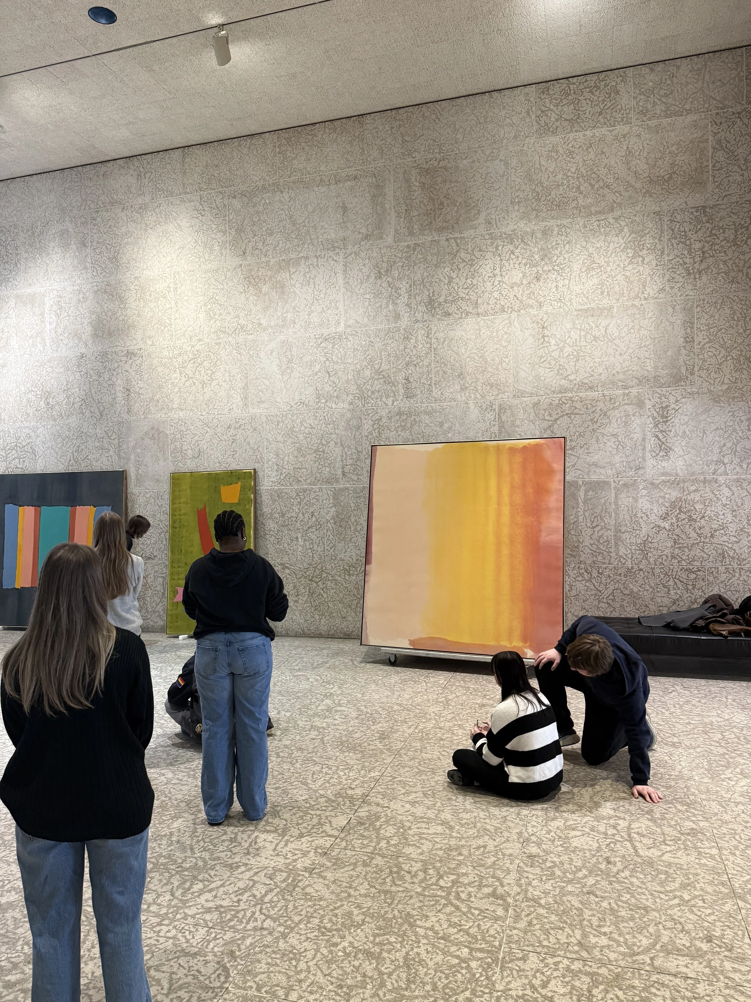
For our final field trip, our class was introduced to and dissected three mid-century modernist paintings from the Winnipeg Art Gallery’s archives. Kenneth Lochhead’s Night Green, Jack Bush’s Red Hook, and Jules Olitski’s Harlow Flow were the works we looked at and discussed, and in making them the backdrop of our conversations revolving mid-century modernism more broadly, the theme of these three artists negotiating their respective personalities into ‘major art’ recurred in our notes and conversations. In our previous essays, we had already investigated some of the values that may have been expressed and embedded in Lochhead’s paintings, and for Bush, we looked for traces of his background in advertisement which he seeks to ‘balloon’ into the category of high art. The most evident display of an internal conflict, in my opinion, was Harlow Flow. The painting’s saturated colours and prodigious presence struck me as a superfluous, multi-faced painting that embodies the spirit of many artists we looked at throughout our class lectures. I was enthralled, and admittedly a bit repelled by its potency and – as one of my classmates put it – how “disgustingly sentimental” it was. In this essay I will closely read Harlow Flow, Jules Olitski’s 1963 painting. I will pay close attention to the right side of the painting to try and enunciate its ebullience and its internal conflict which Michael Fried’s Three American Painters essay speaks to in Olitski’s oeuvre more broadly. The implications of Olitski’s negotiation between his personal convictions and of status quo modern painting are embodied in Harlow Flow’s appearance as well as the process which conceived it.
Harlow Flow has an overbearing presence. Its size definitely plays a role in this, but its true vulgarity comes through the intensity of the painting’s eloquent monochromatic colours, which are accentuated by the more ecstatic moments towards the right side of the paintings. On the left, Olitksi presents a gorgeous Rothko-Esque moment consisting of a flattened, floating, blush-colored orb hovering above a purple ‘landscape’ constructed by wet paint. Layers upon layers of paint formulate a sense of immensity, which is both countered and encouraged by the sharp, but never straight borders surrounding each colour. Its enormous size, surface flatness, and arbitrary form is overwhelming but not particularly needle-moving in the grand scheme of modernist painting. Seeing it in person, I was immediately reminded of my experience seeing Mark Rothko’s Number 16 (Two Whites, Two Reds) colour field painting in Montreal, and with time, Harlow Flow began to rhyme with some of the works of Morris Louis and Helen Frankenthaler, which I have not seen in person but am familiar with thanks to our extensive investigations throughout this class. This echoing of his contemporaries could be read as Olitski showing off his “advanced taste,” something that Fried rightfully identifies as an asset of Olitski’s, one which he often uses as a stool to reach for his convictions.
Like the paintings of Morris Louis, Harlow Flow wants to redefine its relationship between itself and time. Read from left to right, the painting speaks to the continual coloring and staining of its canvas. On the left we see the semi-translucent effects of wet paint, which seamlessly fades into heavy layers of paint, then pouring, and if we continue to read in this direction, we are led to a deconstruction of the painting’s formal aesthetic and coherence. On the right side, paint frees itself and overrules any previous sense of formal rigor found on its left. This, along with the severely stained backside of the canvas, become fossilized evidence of Olitski’s clinical process. Another example of time being teased can be seen below on the right side. Here, this grandiose accumulation of paint emulates, plays with, and defies what gravity does with time. The bottom of the yellow and orange section – decorated with lines of patina – hold and communicate a carnal sense of weight and suspension over the salmon-colored background, like heavy theatre drapes. It exudes a constant state of suspension, both as a gravitational surrender to attrition, as well as a tease to the picture’s own ‘uncovered’ potential. It could be said that here, Olitski acknowledges his ongoing negotiation between his own taste and that of his contemporaries by ‘covering’ his true convictions in the name of ‘formal painting.’
Tidal waves on the brink of splashing down are suspended high above the curtains, and between the two is an amalgamation of paint-perturbed canvas. Even though this space has been claimed by the yellow, in its dominion, the yellow’s only details are the results and consequences of the monotonous procedure which led it here. Beyond it, there are several lines of what looks to be creases, likely accumulated from the way in which the canvas was rolled. These lines emphasize the painting’s verticality, and the space that yellow holds compared to blush. Unlike the blush side of the painting, the right side’s edges are flared and undefined. Mirroring the blush corners which tease the hors-champ, the tidal waves and flares appear as though they are actively trying to occupy more space. The repetition expressed through the process of layering, the pours, and the constant rolling of the canvas all become the image itself. The tail begins to wag the dog as Olitski’s painting becomes a self-sufficient operation of pictorial occupation which only exacerbates its own dysmorphia.
Olitski’s desire to colonize the canvas with his own personal taste is clear. Just as Fried identifies in other Olitski paintings, Harlow Flow – through colors and form – strives to reach unearthed grounds, however the painting’s negotiation turns the canvas into a field of internal conflict and incoherence. This is because Olitski practically shoehorns his impulses onto and into the canvas in such a gross manner. The right side of Harlow Flow becomes a site for Olitski to claim as his, an opportunity to colonize space without building anything clear. His unfinished, continual desire to overthrow his own formal rigor is pictorially manifested, and it showcases his confusion and indecision, becoming the focal point of the painting. His ‘conviction’ does not lead him anywhere but in a position where he occupies arbitrary space. Despite Olitski’s evident awareness of corners which he communicates with the blush orb, the curtain and the tidal waves have a disseminating push to cover and occupy space inside and beyond the canvas. Michael Fried spoke about Olitski’s ability to repackage colours; he says that his level of saturation and articulations make colours feel ‘new,’ and in combining them, he creates interesting and unexpected colour dynamics. Fried says that this unity is comparable to Northern Renaissance paintings such as Jan Van Eyck’s Arnolfini Portrait, in that a clear, complex pictorial situation emerges out of otherwise arbitrary objects. In response to this, I would agree with Fried’s notion, but I would also say that Harlow Flow’s unity almost solely lies in that both worlds – advanced taste and conviction – share a canvas. Their internal conflict is not a dance nor music as Fried describes, but a continuously growing occupation, a colonial project in which the strives of Olitski’s acquisition for real estate becomes the picture itself, vandalizing the footprints of his peers in the name of self-gratification and exposure. The situation he communicates, one of perpetual expansion, is clear but void of depth in favor of claiming surface space.

A Case for Barnett Newman’s “Voice of Fire.”
“Art reveals to us our capacity for meaning making in the absence of traditional authority, in the absence of God, in the absence of some divine ordering of the world, art reveals to us that we are capable of being divine. We are capable of doing that which God previously did.”
In March of 1990, The National Gallery of Canada purchased a striped, six by two metered red and blue painting for a measly 1.8 million dollars. The painting in question, Voice of Fire by Barnett Newman, was made in 1967 as part of Montreal’s Expo 67. You would think that this painting would be greeted with kindness upon its return to Canada, but its reception was quite the opposite. The great irony of the painting’s enthusiastic disavowal is that it speaks to the power of art. I would like to declare that this is one of the greatest painting acquisitions in Canadian history; its ability to elicit feelings among Canadians (whether positive or negative) by means of its simplicity is something worth celebrating and studying.
The painting is enormous. It consists of a blood-red center complimented and framed by deep navy blue. There are no explicit connotations behind the use of these colours, but their union to me felt heroic, luxurious, and a bit religious. It stretches over 6 meters in length, and because it is so strictly horizontal, it completely imposes over and dwarfs its viewer, commanding to be looked at as an ascension. In hindsight, its dominance by means of radical simplicity reflects Greenberg’s observation that “you feel as though you are in the presence of high art” when you confront Newman’s paintings. Another thing Greenberg noted was Newman's “Honesty” as well as his “Nerve and Conviction.” I find these three qualities in Newman’s certainty and courage to bring to life a painting that could have been incredibly mundane. This certainty is reflected in the calculated flatness of his colours and sharpness of his line, as well as the size (and consequential “volume”) of this work. This high praise that I, Greenberg, and others would like to give this painting might shock you, but believe me, you cannot rely on your phone or computer screen to simulate the experience of seeing this work in person. Regardless, the refusal for this painting to be taken seriously, I believe, does not discredit its power but actually confirms it.
Newman’s painting is alien compared to other abstract artists like Van Gogh, Picasso, and Manet, who aren’t necessarily ‘realists’ but their art still holds to a degree of representationalism (incidentally, each one of them has a handful of works at the NGC). Despite this, what they and Newman have in common is that their art is part of the shift in Western painting, a result of the advent of photography and the disembodiment of the bourgeoisie and the proletariat (this is further examined and interpreted in Greenberg’s Avant-Garde and Kitsch essay). The consequence of modernity for Western painting was that the practice had to become something new; it could no longer exist as it did before. The days in which painting was something to ‘trick us’; to mediate a sense of drama and hide its limitations through realism and calculated perspective to edify the church, were gone. Instead, painting had to make sense of itself, question its limitations, and reduce and/or add to its core components in order to enrich itself and remain relevant in modern culture. Instead of concealing painting’s flatness, its respective size, and other limitations, modern painting celebrated these aspects and embraced them into the picture itself. When speaking of Manet’s paintings, Clement Greenberg described his work as the first modern pictures due to “the frankness with which they declared the flat surfaces on which they were painted.” The practice of painting went from being a strictly religious tool dominated by elected ‘masters,’ to having nearly every aspect which made it what it was stripped away, and it never lost its mysticism and meaning-making abilities in the process.
Taylor from @theyearbookcommittee (link to their video below) describes this perfectly:
“Art reveals to us our capacity for meaning making in the absence of traditional authority, in the absence of God, in the absence of some divine ordering of the world, art reveals to us that we are capable of being divine. We are capable of doing that which God previously did.”
With this in mind, think about how Barnett Newman radically simplifies painting. His picture is simply two borders of opposing colours (or you can read it as one border repeated twice by mirroring itself). Yet, it still has the pictorial energy to elicit fear, angst, confusion, and other feelings. Like the minimalist movement which came very shortly after Newman, the painting has a degree of objecthood – that is, it seems to have its own totem-like agency or ‘voice.’ Voice of Fire doesn’t need a figure or face to confront and offend you; it just does. Its imposing presence that I spoke of earlier works despite its minimalism, in fact, it is implicitly from its minimalism that it strikes us. Newman plays with this idea in other ‘zip’ paintings like Vir Heroicus Sublimis and Who’s afraid of Red, Yellow and Blue, which exude a sense of bloated hubris simply through colour, size, flatness, and their titles; these things – which traditionally were arranged to exist beyond the realm of the flat picture – become the picture’s sole subject matter and voices. In the same way Newman reduces Voice of Fire to an irreducibly complex picture; I’d argue that he brings forth a defensive, animalistic reaction in people as though the paintings ‘objecthood’ is looking us in the eye. If the painting were bad, you wouldn’t be moved, but the fact that it causes outrage is the actual embodiment and confirmation of its power.
A reddit comment from a forum speaking of the painting says it better than I could “If art is made to elicit feelings, or spark discussion, I’d say the artist completely nailed it.” For the sake of fun, with all this in mind someone could maybe even draw a conclusion that there are hidden figures in Voice of Fire – that is, the angry public who almost have a degree of ‘Caravaggio-Esque’ drama in their reactions to this painting. There’s more to this painting that simply can't be explained. You have to go see it in person and feel its influence on your body. Newman’s painting is an unforgettable, moving piece of art, even if you find it to be offensive to some degree. Ask yourself how three stripes manage to give a lot of us a knee-jerk and almost primal sense of defensiveness. Consider the power that painting still has in spite of its disconnection from the ‘divine’. If it angers you, it’s good art.
Sources
Newman, Barnett. Voice of Fire, 1967. Acrylic on canvas. National Gallery of Canada.
https://csmt.uchicago.edu/glossary2004/objecthood.htm
Feeling is All; Art Chronicle (1952)
https://www.youtube.com/watch?v=LtL4VOWdG20&t=427s
What Will the Post-Truth Era Look Like for Architecture?
“… Is this not a casting call for architects? Imagine a world where we can explore, confront, and redefine billions of perspectives of knowledge, virtues, behavior, and the human condition through architecture.”
This text does not aim to precisely define what post-Truth architecture will look like. Rather, it's my personal opinions formulated upon research on post-Truth art, as well as prior knowledge stemming from my experiences with art history. Sources are mentioned in the text, but also available upon request.
We are living in the “post-Truth” era; the direct consequence of post-modernity, which can be broadly defined as the “death” of modernity and “Grand narratives.” Although “post-Truth” generally applies to politics, especially in the wake of “fake news,” and “Feelings-over-facts-” rhetorics, the result of this emerging zeitgeist is starting to spill into our daily lives. Artists have already begun to experiment with what this means for art, but there is virtually no talk on what the post-Truth era will look like for architecture. Do we, as architects, design our way back to a regressed, simplified way of life, championing (the now outdated) “Truth?” Or do we embrace the absurdism of a world where the concept of “truth” is archaic, and reality is subjective for each and every one of us? I’d suggest an alternative somewhere between these two extremes.
As precedents, we can look at examples of post-Modern art – let's call these examples Para-fictional experiences, as Carrie Lambert-Beatty puts it – to try and decipher how post-Truth might echo into architecture. In a Harvard VPAL event, Lambert-Beatty brings up Para-fictional art precedents, such as Michael Blum’s house museum titled "A tribute to Safiye Behar” (2005), which was an incredibly intimate gallery of “belongings” of a fictional character that Michael Blum invented. The point of this house museum was to touch the hearts of viewers and to build a connection between them and Safiye Behar, a controversial “freedom fighter”, whom here, is presented as someone we can relate to – although Safiye Behar never existed. With this, Blum humanizes people who carry differing ideologies which many would have otherwise overlooked.
Another example brought up by Lambert-Beatty is Coco Fusco and Guillermo Gomez-Pena's “Two Undiscovered Amerindians Visit the West,” (1992-93) in which they dressed as “Amerindians” undiscovered by Colombus and went on tour across Europe and the United States, making themselves a “human zoo”. This satirical performance piece directly confronted agency, voyeurism, the White gaze, White supremacy, colonialism, and orientalism, just to name a few. Here’s another: When Fred Wilson, an African American artist, was asked to do a presentation on African American art at the old Whitney Museum, he decided to do his own Para-fictional art piece. Before Wilson’s presentation, he shared lunch with the people who came to see him, left early, and instructed them to meet him at the gallery when they were done eating so that he could begin the tour. They made their way shortly afterwards, waited for him, and finally Wilson, who was dressed as a security guard the entire time, presented himself to them.
The driving force of these types of interventions can be defined as “epistemic friction.” They are incredibly powerful and pierce through problematic ways of seeing in a way which social media can never do. Jose Medina says that epistemic friction - through actual embodied encounters and specific events - can cause real disruptions that trigger the fracturing of one's “subjectivity”. Furthermore, I’ll add that these Para-fictional experiences in the real world are what is necessary to confront problematic, unilateral narratives associated with the “Grand narrative” of White supremacy. Confrontations like this are far too big to be projected onto our phone screens. Using a feelings-over-fact mantra, we can reveal the multifaceted face and nature of “Truth.” Medina also expressed his wish for society to be able to stimulate these kinds of events in our everyday lives. Is this not a casting call for architects? Imagine a world where we can explore, confront, and redefine billions of perspectives of knowledge, virtues, behavior, and the human condition through architecture.
With the death of the Grand Narrative, Post-Truth is our opportunity to implement decolonial strategies through architecture. Like post-modernism's championing of all eras, post-Truth architecture can usher ways of design otherwise seen as “primitive,” like the hundred/ thousand-year-old dwellings made by indigenous peoples across the globe, for example. I’d also add that this is our opportunity to use such “design languages” as tools for learning whilst also using them as they were intended to be used, not just pastiche spectacles for our gaze. When I say this, I think of traditional African masks used in certain areas of central, southern, and Western Africa, with peoples such as the Bobo, Bwa, and Mossi people of Burkina Faso, the Sande Society of Sierra Leone, The Dogon people of Mali, and the Nande people of Kongo, just to name a few. Each of the peoples that I mentioned have completely different uses for their masks, the only thing that they have in common is that they are not objects for our gaze. The “Truth” and supremacy of white-boxed, floor to ceiling windowed, modernist-influenced buildings will be behind us, and drown in a world clustered with a multitude of unique “Truths.” We are no longer confined to form over function and vice versa. Our technology allows us the freedom to explore feelings without compromising security, pastiche without bastardization, and homage without regression. As Jaime Hayon - an artist working to define post-Truth art - puts it, “it's about essence.”
I truly believe that post-Truth architecture has the ability to eliminate the myth of “status quo,” not through the destruction of the past, nor spangling itself in non-Western paraphernalia, but by building a rejuvenated future. We are at the apogee of post-Modernism's core values. I thank the post-Modernists for opening the door for these questions and visions to even be conceived, but it's our responsibility as post-Truth architects to walk through the door they opened for us and design new ones.

A Conversation with Colin Neufeld.
Earlier this year, I had the opportunity to visit the office of my favourite architecture firm. The firm in question, of course, is none other than 5468796 Architecture; Winnipeg’s very own world-renowned architecture firm created by U of M alumni Johanna Hurrme, Sasa Radulovic, and Colin Neufeld. While there...
Earlier this year, I had the opportunity to visit the office of my favourite architecture firms. The firm in question, of course, is none other than 5468796 Architecture; Winnipeg’s very own world-renowned architecture firm created by U of M alumni Johanna Hurme, Sasa Radulovic, and Colin Neufeld. While there, I spent the majority of my time interviewing Colin Neufeld, but I also had the chance to briefly speak with Ken Borton, Sasa Radulovic (our conversation exclusively consisted of two uses of the word “hello”), and Jae-Sung Chon, a professor in the U of M’s faculty of architecture.
During my time at 5468796’s office, I was given a detailed tour of their workspace, I got to see their collection of architectural models and sketches (some were made for cancelled projects, which was really cool to see), and I also got some thought-provoking answers to a series of questions I had prepared. Colin told me about some of the misconceptions of working in architecture, he gave me insight into his design process, and details about some of 5468796’s recent projects, such as the Pumphouse, 90/100 Alexander, and the Parkade of the Future in Calgary. When I asked him about his time in U of M’s faculty of architecture, he highlighted the importance of perseverance, putting every single one of your ideas on paper, and both he and Jae-Sung Chon emphasized the power of knowing when to step away from a project because “nothing is ever really finished.”
This visit was incredibly inspiring for me. I am very thankful to have had the opportunity to speak with such brilliant minds who just so happen to be alumni of my school. My conversations with Colin, Ken, & Jae-Sung sparked a light in me and showed me what’s possible for future architects, even in Winnipeg.